
Our rebrand of this magazine began with an aspirational goal. To establish Arc as the leading magazine of American religion and politics. While there are flagship magazines of certain religions or denominations, we felt there was space for a preeminent magazine of the American religious experience and its influence on our politics. We wanted Arc to occupy that space.
To achieve this we had to move beyond a brand that was “fit for polite company”, the slogan that used to occupy this magazine’s masthead, because for some time now neither American religion nor politics have been a consensus conversation. The first change was to the name of this magazine, previously Religion & Politics. We wanted to make the brand more capacious, and less literal. And we wanted to evoke an emotional response, one of curiosity and joy. Finally, there was the expansion of religion and politics into the Et Cetera.
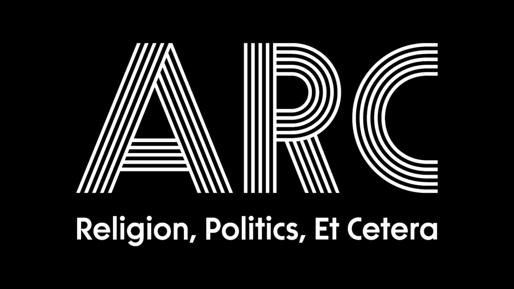
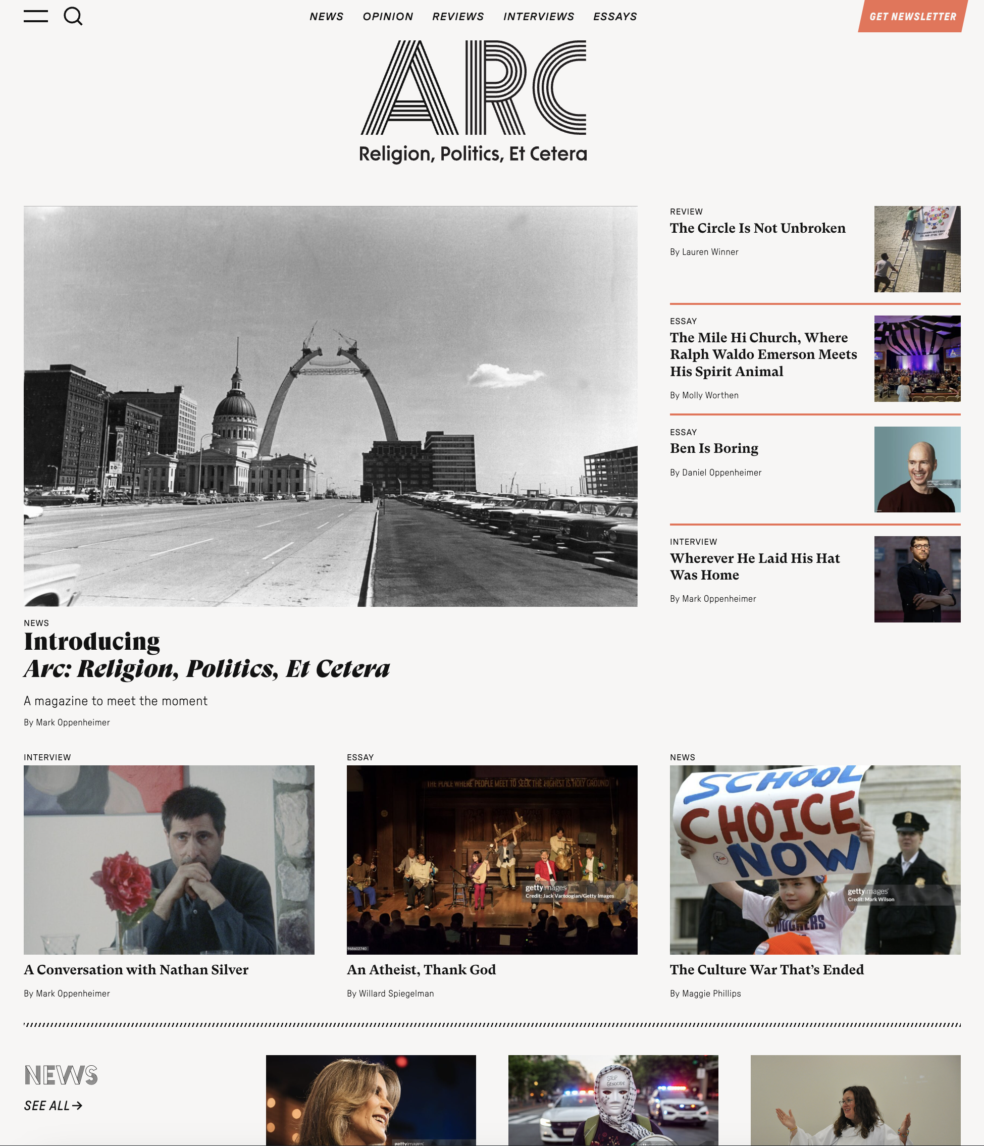
Arc came firstly from the Gateway Arch in the home of this magazine, St. Louis. But it is also the strongest structural shape joining two disparate points, and can be both a bridge and a gateway. An invitation to cross or to enter, and to connect.
Cause + Effect worked closely and collaboratively with Arc’s newly appointed editor, Mark Oppenheimer, and his team on the redesign. Mark came in with a clear vision for Arc. A magazine that was more visually distinct, and variously quirky, whimsical, and brash. Rebellious and respectable. The university professor with the punk band t-shirt. We drew inspiration from Americana, SoCal surf culture, Detroit auto, ’80s deconstruction, street art, and analog print.
A magazine that was more visually distinct, and variously quirky, whimsical, and brash. Rebellious and respectable. The university professor with the punk band t-shirt.
In distilling a guiding design aesthetic, we wanted to draw from divergent design positions and bring them into a cohesive whole, reflecting Arc’s editorial stance. We wanted that tension but also the unexpected interactions and the whimsy. And we wanted to depart from the existing magazine’s centrist design mindset, a middle ground aesthetic that offended no one but was fit for polite company.
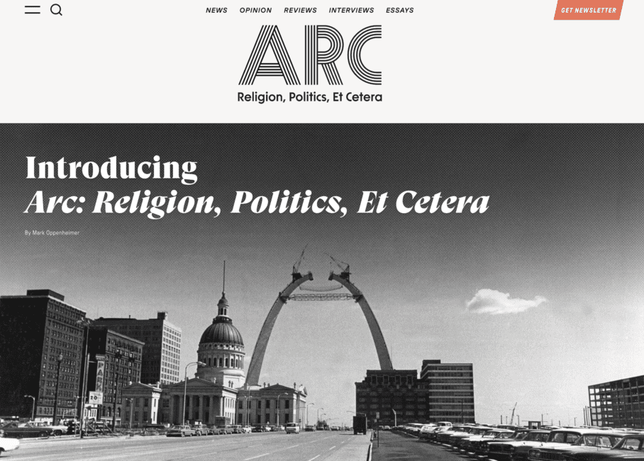
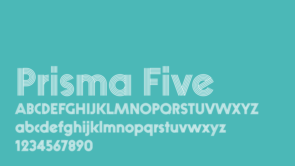
We chose to set the Arc wordmark in Prisma Five, a contemporary interpretation of the 1930 typeface that remains remarkably fresh and distinct from typefaces used in comparative publications. In particular, we found inspiration in classic American muscle car pinstriping in the Prisma Five font. Inspired by stencil street art, at smaller sizes we used Prisma Stencil for legibility. Each vertical also has its own Prisma font to give it a distinct identity within the larger Arc family. And in the spirit of bringing together diverse voices, the Arc masthead contains an Easter egg upon rollover.
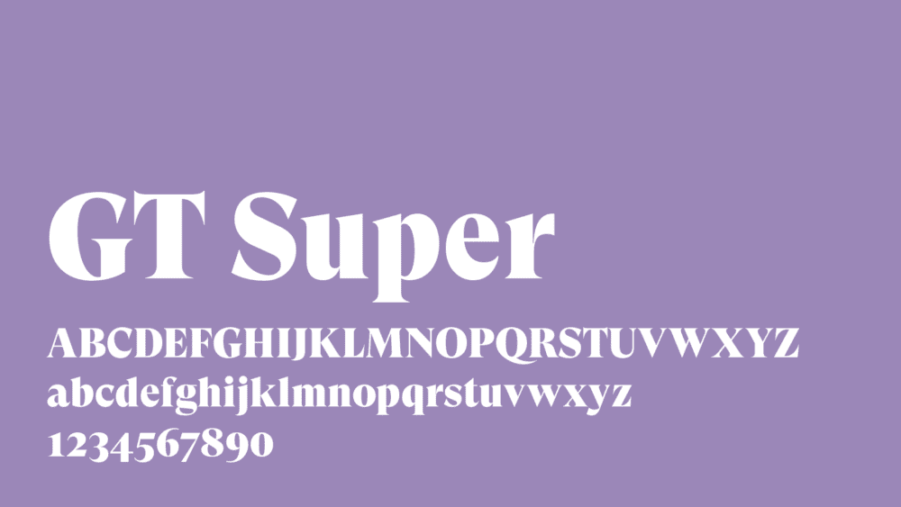
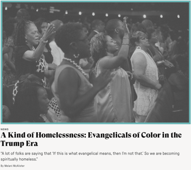
We chose GT Super for headlines and article text. Based on display serif typefaces from the 1970s and ’80s, it celebrates a pre-digital print aesthetic with expressiveness and idiosyncracy.
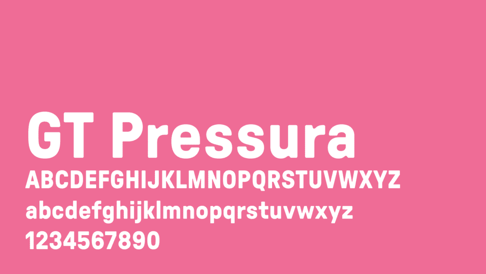
Supporting type is set in GT Pressura, which takes the visual gesture of ink spreading under pressure as a stylistic device, bringing the warmth of analog print back to the digital design space.
Our color palette takes inspiration from the sunny hopefulness of SoCal surf culture and the rebelliousness of 1980s deconstruction and street art.
All content has been reorganized into five verticals—News, Opinion, Reviews, Interviews, Essays—with each vertical given its own Prisma font and primary color to develop a visual taxonomy of content. These colors are used throughout the site to highlight content, direct attention, and for whimsy and delight.
The look and feel of the redesign brings inspiration from the analog print era, a common touchpoint for editor Oppenheimer and us at Cause + Effect, to digital design. Color hero images rollover to black and white halftones. Halftone screens behind overlaid text and the hamburger menu focus attention on the foreground.
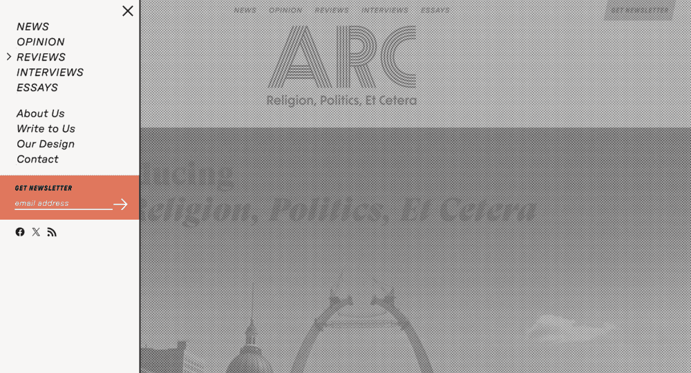
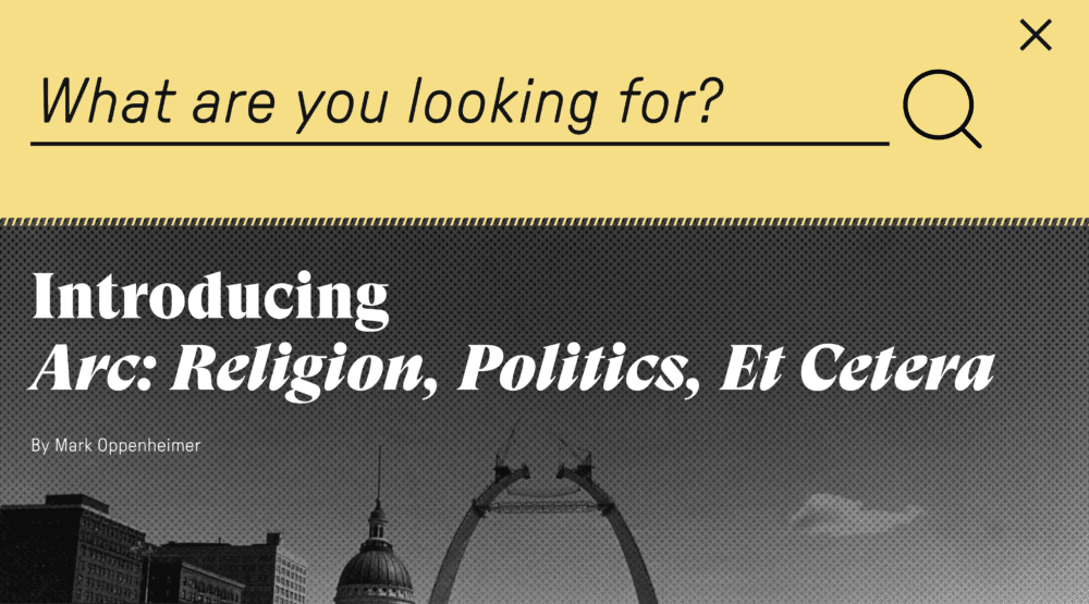
The design of the newsletter signup banner is inspired by Par Avion stamps, with its bold italic san serif all caps design and fringed edges. This inspiration also finds its way into newsletter calls to action, Letters to the Editor calls to action, and the drop down search bar at the top of the page.
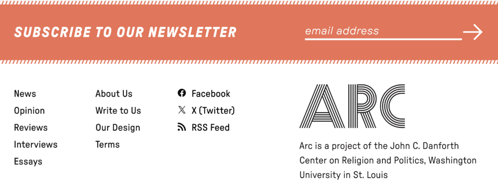
The color rollovers of the top navigation reference different colored tabs of file folders in a filing cabinet. The banners of each vertical landing page are inspired by newsroom tickertape. Dotted lines used to separate sections are based on Letraset fill patterns.
And we set the entire site against a warm ecru background, reminiscent of unbleached newsprint.
We hope you enjoy Arc: Religion, Politics, Et Cetera. We welcome your feedback, either directly or to the magazine.
Linden Goh
Cause + Effect
Brand Identity, Design & Development